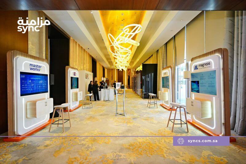
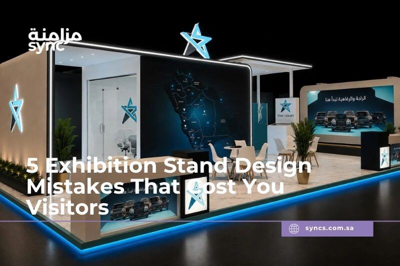
In Riyadh and Jeddah, exhibition halls are filled with brands competing for the same visitor attention. Most visitors decide within a few seconds whether a stand is worth entering. That decision is shaped less by the product itself and more by how the stand reads from the aisle.
A poorly planned exhibition stand design can quietly reduce traffic, weaken brand perception, and lower lead generation even when the product or service is strong.
Below are five common exhibition stand design mistakes that cost exhibitors visitors, with practical ways to fix them.
1. Designing for the back wall instead of the aisle sightline
The mistake: Many exhibitors plan their stand as if the main visual should sit on the back wall. But visitors first see the booth from a diagonal, moving position. If the front and side sightlines are blocked by counters, low walls, or blank panels, the brand remains invisible until it is too late.
Why it hurts visitor traffic: The stand cannot communicate from the main walking path. Visitors do not stop to decode a booth; they keep moving toward clearer signals.
How to fix it: Design from the aisle inward. Keep the front open, raise the main brand message above sightline obstructions, and make sure the stand is readable from multiple angles. In busy Saudi venues in Riyadh and Jeddah, side and diagonal visibility can be just as important as the front view.
2. Cluttered floor plans that block movement and product focus
The mistake: A stand filled with too many displays, product shelves, storage units, and furniture near the entrance creates a visual and physical barrier.
Why it hurts visitor traffic: Visitors hesitate to enter spaces that require stepping around objects. A cluttered exhibition stand layout reduces dwell time, hides key products, and makes the booth feel smaller than it is.
How to fix it: Use clear zones. Keep the first 1.5 to 2 meters near the aisle open. Place the main product or demo where it can be seen immediately, and move storage and private conversation areas to the back or side. Fewer products with stronger visual hierarchy usually perform better than many products competing for attention.
3. Weak brand hierarchy and unclear messaging
The mistake: The stand has the company logo, but the core message is buried in long text, technical specifications, or multiple competing taglines. Visitors see the booth but cannot quickly understand what the company offers.
Why it hurts visitor traffic: Confusion creates friction. If visitors cannot identify the value proposition within seconds, they are unlikely to enter. This is especially costly when a competitor nearby has a clearer message.
How to fix it: Use one primary headline, one short supporting line, and one visible call to action. Make the product category or service clear from at least five meters away. Use contrast, larger typography, and reduced copy. Booth branding should support the message, not replace it. This is why trade show booth design should be treated as a communication system, not a branded backdrop.
4. Flat lighting and low visual contrast
The mistake: Relying only on hall lighting or using uniform lighting without hierarchy can make the stand look flat and lifeless. Dark corners, washed-out exhibition graphics, and poorly lit products reduce visual impact.
Why it hurts visitor traffic: In large exhibition halls, stands with controlled lighting draw the eye first. Poor exhibition stand lighting makes a booth recede into the background and lowers the perceived value of products and services.
How to fix it: Layer the lighting. Use bright lighting on the brand wall, focused spots on products, and softer accent lighting in conversation areas. Ensure the key message has high contrast against the background. A well-lit custom exhibition stand can be visible from across the hall in Riyadh and Jeddah venues with high ceilings and mixed lighting conditions.
5. No interaction point or visible reason to stop
The mistake: The stand looks visually acceptable, but there is no product demo, screen interaction, sample area, or visible entry point. Staff may be standing behind a counter, which creates a barrier.
Why it hurts visitor traffic: Visitors need a reason to enter. A passive stand is observed from the aisle but not used. Without an engagement point, the booth does not generate conversations or leads.
How to fix it: Place one clear interaction point near the open side of the stand. This could be a live product demo, a short screen presentation, a sample station, or an interactive configurator. Position staff close to the entry point rather than behind a desk. The interaction should connect directly to lead capture.
How Professional Exhibition Stand Design Improves Booth Traffic and Lead Generation
The five mistakes above share one pattern: they treat the stand as a display, not as a visitor-conversion system.
In Saudi exhibition environments, the most effective stands are planned around sightlines, visitor flow, brand clarity, lighting, and engagement. For exhibitors considering custom exhibition stands in Saudi Arabia, an experienced exhibition stand builder can identify these issues before production.
At Syncs, exhibition stand design starts with the audience path rather than decoration. That means 3D stand design that tests aisle views before fabrication, custom layouts that keep entry points open, and brand integration that prioritizes message hierarchy. Syncs can help exhibitors move from concept and custom fabrication to installation and on-site execution in Riyadh and Jeddah reducing the risk of building a stand that looks good in renders but underperforms in the hall.
How to Review Your Exhibition Stand Design Before Production
Before approving a design, review it from the visitor’s point of view. Ask:
- Is the main message readable from the aisle in three to five seconds?
- Are the entrance and main traffic path open?
- Is there a clear reason for a visitor to stop and engage?
- Is lighting used to create hierarchy?
- Does the stand support one primary brand message?
A 3D visualization should be tested from multiple angles, not just the front elevation. If the design fails any of these checks, it is easier to correct before production than after the stand is built.
Planning to exhibit in Riyadh, Jeddah, or another Saudi city? If you want to avoid the design mistakes that reduce booth traffic and lead generation, it may be worth reviewing your exhibition stand concept with a specialist. Contact Syncs to discuss stand concept, 3D design, branding, fabrication, and on-site execution.
FAQs
What makes a good exhibition stand design?
Good exhibition stand design is readable from the aisle, has a clear brand hierarchy, uses lighting to create contrast, keeps visitor flow open, and includes one visible engagement point. It should communicate the core message in seconds and support lead generation.
How can an exhibition stand attract more visitors?
Attract visitors by improving aisle visibility, using a clear headline, reducing clutter, adding layered lighting, and placing an interactive demo or product display near the open entrance. Staff should be positioned at entry points, not behind barriers.
What are the most common exhibition booth design mistakes?
The most common mistakes are poor sightlines from the aisle, cluttered layouts, weak brand messaging, flat lighting, and a lack of visitor interaction. These reduce booth traffic and lower exhibition ROI.
How important is lighting in exhibition stand design?
Lighting is critical. It creates visual hierarchy, draws attention from a distance, highlights products, and makes the stand look more professional. Without controlled lighting, a booth can disappear into the hall.
How should an exhibition stand be designed for visitor flow?
Design for visitor flow by keeping the front 1.5–2 meters open, placing a clear visual anchor near the aisle, moving storage to the back, and creating zones for attraction, demonstration, and conversation. This makes entry feel natural.